Hi this is Team Merchant Navy Decoded !!!

Please fill the below form with your query and we will get back to you in next 12 hours.

Rest assured your data is safe with us !!!🙂

Ask Your Query

Indicator Diagrams on Ships

Indicator Diagrams on Ships

Ask any marine engineer what tells you the real story of what’s happening inside a cylinder, not what the gauges say, not what the manual predicts, but what’s actually going on during combustion and most will point to the indicator diagram. It’s one of the oldest diagnostic tools in the trade, older than digital monitoring by well over a century, and it’s still the reference every modern engine performance system tries to reproduce.

This post covers what an indicator diagram actually is, how it’s taken, how to read one, and what the common fault patterns look like when something inside the cylinder isn’t behaving.

What Is an Indicator Diagram?

An indicator diagram is a graph of cylinder pressure plotted against piston displacement (or crank angle) over one complete working cycle. In simple terms, it’s a picture of the pressure rise and fall inside a cylinder as the piston moves from top dead centre to bottom dead centre and back.

It’s called an “indicator” diagram because it was originally produced by a mechanical instrument called an engine indicator, attached directly to the cylinder. Today, most vessels use electronic pressure pickups and a computerized indicator system, but the underlying principle  pressure versus volume  hasn’t changed.

The diagram matters because it directly shows:

  • Peak firing pressure (Pmax)
  • Compression pressure (Pcomp)
  • The shape and timing of the combustion process
  • The work done by the gas on the piston during the power stroke

From that shape, an engineer can calculate power output and, just as importantly, spot mechanical problems long before they show up as a bearing failure or a burnt piston crown.

Types of Indicator Diagrams

There are four distinct diagrams that can be taken off the same cylinder, and each one is set up differently on purpose : The drum timing, the spring rate, and whether fuel is even being injected at all change depending on what you’re actually trying to see.

1. Power card (power indicator diagram) — 

power indicator diagram

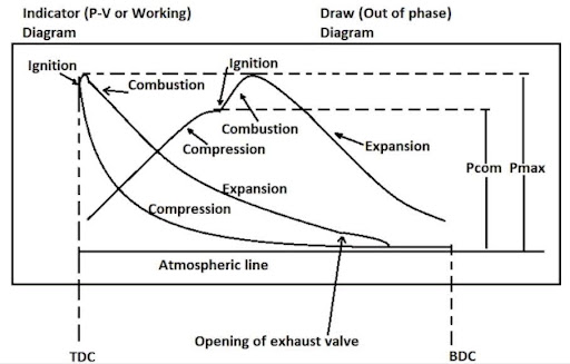
This is the standard diagram, taken with the indicator drum rotating exactly in phase with piston movement. The area enclosed by the card represents the work done over one complete cycle, to scale, and this is the diagram used to work out the Mean Indicated Pressure (MIP) and calculate power produced in that cylinder.

2. Compression diagram — 

 Compression diagram

Taken the same way as the power card, but with fuel shut off to that unit, so there’s no combustion event at all — just the compression and expansion of trapped air. The height of the curve gives the maximum compression pressure. If the compression and expansion lines coincide neatly, that’s actually a good sign — it confirms the indicator itself is correctly synchronized with the engine. A noticeably reduced height on this diagram points to low compression, which can come from a worn cylinder liner, faulty piston rings, insufficient scavenge air, or a leaky exhaust valve.

3. Draw card (out-of-phase diagram) —

Draw card

 Taken with the fuel pump still engaged, same as a normal power card, but with the indicator drum deliberately set 90 degrees out of phase with the piston stroke. Shifting the phase like this stretches out and exaggerates the pressure changes happening during fuel combustion, making it much easier to read exactly what’s going on at the moment of injection. This is the diagram of choice for spotting fuel timing problems or injector faults.

4. Light spring diagram — 

Light spring diagram

Taken in phase with the engine, like the power card, but with a much lighter compression spring fitted to the indicator. Because the spring is so much weaker, the high combustion pressure drives the stylus off the scale, while in the low-pressure portion of the cycle  the exhaust and scavenge events  get shown at a much larger, more readable scale instead. This is specifically the diagram used to catch faults in exhaust valve timing and scavenging.

The area under any of these diagrams is worked out either with a planimeter (the usual method used on board) or by the mid-ordinate method where a planimeter isn’t available.

Between these four, an engineer can isolate exactly which part of the cycle is misbehaving  combustion timing, compression, or the exhaust/scavenge side  instead of staring at one diagram and guessing.

Table of Contents

How an Indicator Diagram Is Taken

Mechanical indicator (older/manual method):-

Mechanical indicator

A mechanical indicator is fitted to the indicator cock on top of the cylinder cover. A cord, driven off the crosshead or a reducing gear linked to crankshaft motion, moves a drum wrapped with paper in sync with piston position, while a stylus connected to a pressure-sensing piston traces the cylinder pressure onto that paper as the engine runs. The card produced is literally called a “card” — hence the old phrase “taking cards.”

Electronic indicator (modern method):-

Electronic indicator

A piezoelectric pressure sensor is fitted at the indicator cock, and a crank-angle encoder on the flywheel or shaft provides position reference. A dedicated indicator unit or a permanently fitted online monitoring system (common on modern engines) continuously records pressure against crank angle and displays the diagram digitally calculating power, Pmax, Pcomp, and other values automatically.  

Basic procedure (either method):-

  1. Ensure the indicator cock and connections are clean and the sensor/indicator is properly fitted and calibrated.
  2. Take the reading with the engine running at steady load diagrams taken during unstable conditions are unreliable.
  3. Record the diagram for each unit in turn.
  4. Compare Pmax and Pcomp across all units – a healthy engine should show fairly even values cylinder to cylinder.
  5. Note any abnormal diagram shape for further investigation.

Reading the Diagram

A normal indicator diagram for a four-stroke or two-stroke diesel engine follows a recognizable loop shape:-

  • Compression line – Pressure rises smoothly as the piston moves up before injection.
  • Combustion/firing peak (Pmax) –  A sharp pressure rise once fuel ignites, reaching the highest point of the cycle.
  • Expansion (power) line – Pressure falls in a controlled curve as the piston is driven down, doing useful work.
  • Exhaust/scavenge portion – Pressure drops toward the baseline as exhaust gases leave (and, on two-stroke engines, scavenge air enters).

The area enclosed by the diagram represents the work done per cycle, which is where the diagram earns its keep for power calculation.

Calculating Indicated Power (IP)

From the diagram, the Indicated Mean Effective Pressure (IMEP) is derived,  essentially the average effective pressure acting on the piston over the whole cycle, found by dividing the enclosed area of the diagram by its length and applying the pressure scale.

Indicated Power is then calculated using:

IP = (PLAN) / n

Where:

  • P = Indicated Mean Effective Pressure (IMEP)
  • L = length of stroke
  • A = area of piston
  • N = engine speed (RPM, adjusted for cycle type)
  • n = number of crank revolutions per working stroke (used for four-stroke engines; two-stroke engines fire once per revolution)

This calculation, repeated per cylinder and summed, gives total indicated power, and comparing it against measured shaft power (brake power) tells you the engine’s mechanical efficiency.

Irregularities in Indicator Diagrams

Irregularities in Indicator Diagrams

Before jumping to “the engine has a fault,” it’s worth ruling out a simpler possibility: Sometimes the diagram itself is distorted by the indicator instrument or setup, not by anything actually wrong inside the cylinder.

These instrument-related irregularities show up fairly often, especially with mechanical indicators:-

  • Rounded corners instead of sharp ones – Usually caused by a sluggish indicator piston, worn linkage, or a spring that’s too stiff for the pressure range being measured
  • Wavy or vibrating lines along the trace – Typically the indicator spring or mechanism resonating, rather than a genuine pressure fluctuation in the cylinder
  • A shifted or drifting atmospheric (zero) line – Points to a leaking indicator piston or a fouled indicator cock, not an engine problem
  • An unusually pointed or narrow peak – Can result from a spring that’s too light for the actual cylinder pressure, exaggerating the sharpness of the combustion rise

Irregularities in Indicator

The reason this distinction matters: chasing a “fault” that’s actually just a tired indicator mechanism wastes time, and worse, it can mask a real problem sitting underneath the instrument. Before reading too much into an odd-looking diagram, it’s worth checking the indicator gear itself connections, spring condition, cock cleanliness  before assuming the cylinder is the problem.

Common Fault Diagrams

This is where the indicator diagram earns its reputation as a diagnostic tool rather than just a performance record. Certain faults produce recognizable, repeatable distortions in diagram shape:


Fault

Diagram Signature 

Likely Cause

Early fuel injection (pre-ignition)

Sharp pressure rise before TDC, rounded peak shifted earlier

Injection timing advanced, faulty fuel valve

Late fuel injection (after-burning)

Pmax delayed, rounded/flattened peak after TDC

Injection timing retarded, sluggish fuel pump

Leaking/blowing piston rings or worn liner

Reduced Pcomp and Pmax, rounded compression curve

Worn rings, scored liner, blow-by

Leaking exhaust valve

Pressure fails to build fully during compression, diagram appears “cut off”

Valve not seating, burnt valve seat

Choked or dripping fuel valve

Irregular, spiky, or double combustion peak

Fuel valve nozzle fouling, poor atomization

Air/scavenge leakage

Lower peak pressure, incomplete combustion loop

Scavenge port fouling, turbocharger issue, leaking joints

Excess Pmax

Sharp, unusually high peak

Over-fuelling, incorrect timing, faulty governor

Because each fault leaves a distinct fingerprint, engineers can often narrow down a developing problem to a specific cylinder and a specific mechanical cause  injection timing, ring condition, valve seating without opening up the unit at all.

Why This Still Matters With Modern Monitoring Systems

It’s tempting to think that with continuous online cylinder pressure monitoring on modern engines, the old-fashioned “taking cards” exercise is obsolete. In practice, the principle is exactly as relevant as ever: Modern systems are just automating the same pressure-versus-crank-angle analysis in real time, cylinder by cylinder, and flagging the same fault signatures automatically. Understanding what the diagram is actually showing is still what lets an engineer trust  or question  what the automated system is telling them.

Conclusion

The indicator diagram turns something invisible : Combustion happening inside a sealed cylinder at several hundred bars  into a shape you can read at a glance. It’s used to calculate power, to balance load evenly across cylinders, and to catch mechanical faults early through recognizable distortions in the pressure curve. Whether it’s taken with a century-old mechanical drum indicator or a modern piezoelectric sensor feeding a shipboard monitoring computer, the underlying idea hasn’t changed: pressure against position tells you the truth about what’s happening inside the engine.

Frequently Asked Questions (FAQs)

It’s used to determine cylinder pressure behaviour through the working cycle, calculate indicated power, balance load between cylinders, and diagnose combustion or mechanical faults.


Pcomp is the peak pressure reached during compression before fuel injection; Pmax is the peak pressure reached after combustion, which is always higher and is the key value for combustion performance monitoring.

By finding the Indicated Mean Effective Pressure (IMEP) from the enclosed area of the diagram, then applying the formula IP = PLAN/n using stroke length, piston area, engine speed, and revolutions per working stroke.

Yes  distortions such as a rounded compression curve, a delayed or double combustion peak, or reduced Pmax often appear well before the underlying issue (worn rings, leaking valve, fuel valve fouling) causes a serious failure.

Yes. Electronic systems automate the same pressure-versus-crank-angle principle, but understanding how to read the diagram is still what allows an engineer to verify, interpret, and trust the automated readings.

Disclaimer :- The opinions expressed in this article belong solely to the author and may not necessarily reflect those of Merchant Navy Decoded. We cannot guarantee the accuracy of the information provided and disclaim any responsibility for it. Data and visuals used are sourced from publicly available information and may not be authenticated by any regulatory body. Reviews and comments appearing on our blogs represent the opinions of individuals and do not necessarily reflect the views of Merchant Navy Decoded. We are not responsible for any loss or damage resulting from reliance on these reviews or comments.

Reproduction, copying, sharing, or use of the article or images in any form is strictly prohibited without prior permission from both the author and Merchant Navy Decoded.

DIWALI SALE

Decoded Discount Alert! up to 50% OFF

DIWALI SALE

Decoded Discount Alert! up to 50% OFF

Use Coupon Code Deep50

Days
Hours
Seconds
0
Would love your thoughts, please comment.x
()
x